
Toolbar buttons and constraints
-
Icon System: Icons are sourced from Google's Material Symbols library.
-
Design Challenges (not comprehensive)
- Represent abstract operations as icons, e.g., how to communicate that a button will trigger a tabs sort by site, and in ascending order? The premade icon for sorting tabs by most recently accessed was comparatively straightforward . For the domain sort button, I adapted the (since variations are sometimes used generically to reference the interwebs). I "paired it" (inelegantly bolted) an upward version of the arrow from the the other sort icon.
- Distinguish tabs from windows: how to clearly differentiate icons for tab operations (like close duplicates) from window operations (like the current/all windows toggle)? and
- SVGs are not my forte. I probably spent as much time refining the files, troubleshooting alignment, and managing the sprite system as I did on actual extension features. Biggest issues involved customizing the two sort icons to improve the visual match. In retrospect, there were other approaches that would have been simpler.
- ~Vertical alignment: Depending on the angle you're looking (especially at the smaller sized versions), there's a bit of an optical illusion that makes the two sort icons appear misaligned.

Undiscovered Features
These are newer features that need entry points or visual cues.
Toggle URL Display
Keyboard shortcut: ⌥ + U (Mac) or Alt + U (Windows)
This feature hides/displays site URLs in the tab list. In addition to the question of where to make the feature more visible, this is also an example of the difficulties of making UX decisions without user feedback. Display or not display the urls by default? I'm too partial here -- I like the additional information + the softer spacing between tab listing due to the lighter text.
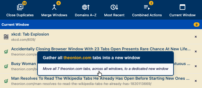
Gather Tabs by Site
I added this as a counterpart to the Close by Site feature. I considered adding a toggle or an entry point in the Close by Site section, but was concerned it might facilitate accidental actions.
Reducing Friction
No Confirmation Dialogs
No "Are you sure?" before taking action. I decided against the additional friction since the core purpose of the TTD is to enable rapid tab culling and organizing so you can get on with your day. I also decided against providing an "undo" button, since Chrome's built-in Cmd+Shift+T (Mac) or Ctrl+Shift+T (Windows) restores tabs that have been closed.[1]
No Toast Notifications
Operations complete silently without "Success!" toasts or other visual noise. Most of TTD's operations (merging windows, sorting tabs) are already conspicuous. For long-running operations (e.g., merging windows along with hundreds of tabs), buttons show a mild animation to indicate progress.
Notes
- ↑ Tradeoff: A very reasonable case to be made that my approach violates UX user control and freedom principles. As a user I'd rather have direct control, including the ability to walk back mistakes, rather than speed bumps or heavy handed guardrails. On the other hand, an "undo" system would add greater complexity to the codebase and pull from the very finite pool of time and resources for this side project. It comes back to some classic feature tradeoff considerations, more challenging due to limited insight into user priorities.